


With the Flutter DateTime Picker plugin, you can add date & time pickers to your native application. The plugin’s interface is inspired by the iOS Cupertino style menu.
What you’ll build?
In this tutorial, you’ll build a mobile app featuring a DateTime Picker using the Flutter SDK. Your app will:
- Display separate Date & Time Pickers with a minimalistic interface
- Display the selected data as outputs to console
This tutorial focuses on adding a DateTime Picker to a Flutter app. Non-relevant concepts and code blocks are glossed over and are provided for you to simply copy and paste.
Github Repository | ShivamGoyal1899
Package Used | flutter_datetime_picker
Setting up Flutter on your machine
The detailed steps to install Flutter on your personal computer & getting started with Flutter is available in the following blog
Component Syntax
The basic format of a DateTime Picker looks like the one below:
Adding DateTime Picker plugin as a dependency
Adding the additional capability to a Flutter app is easy using Pub packages. In this tutorial, you introduce the DateTime Picker plugin by adding a single line to the pubspec.yaml file.
Importing plugin to main.dart file
Import flutter_datetime_picker dependency to your main.dart file by adding the following line at the starting of the file:
Putting Code in action
Amend your main.dart file as per the following code:
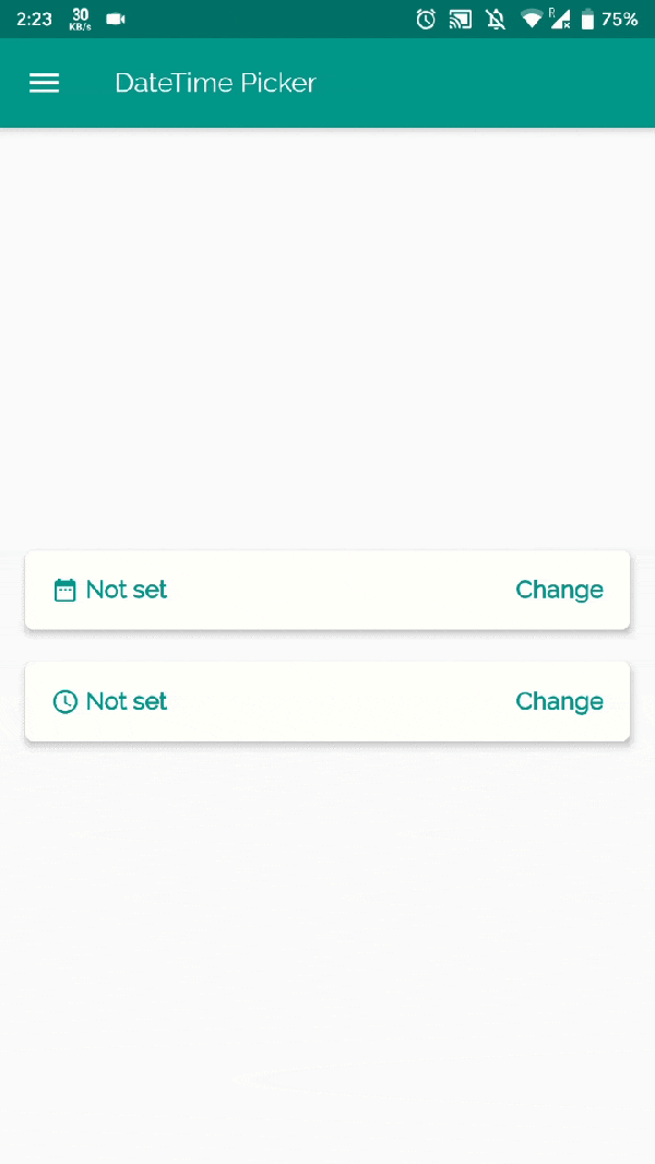
Building & running the application
- Connect your Emulator or physical Android device to test the application.
- Click on Build & Run.
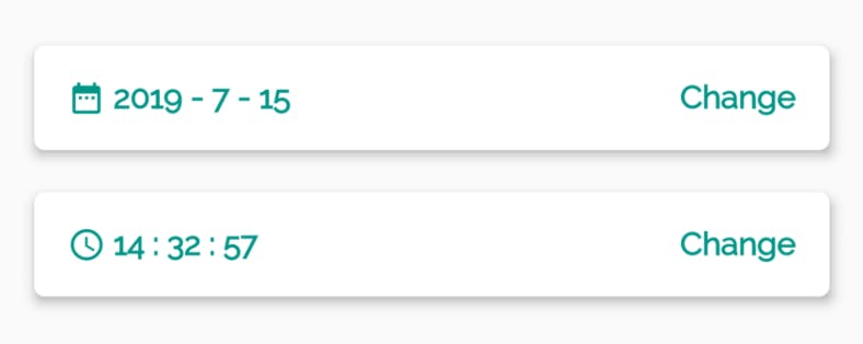
- And Boooom, your app is ready. The final build would look like the below illustration.
Customization Options
There are three functional variations of the plugin available as follows:
- Solo DatePicker
- Solo TimePicker
- Dual DateTimePicker
Language Options
There are various language options available to implement the plugin for international use. For changing the language of the component amend the following with preferred LocaleType.
locale: LocaleType.en
- English(en)
- Persian(fa)
- Chinese(zh)
- Dutch(nl)
- Russian(ru)
- Italian(it)
- French(fr)
- Spanish(es)
- Polish (pl)
- Portuguese(pt)
- Korean(ko)
- Arabic(ar)
- Turkish(tr)
- Japanese(jp)
- German(de)
- Danish(da)
- Bengali(bn)
- Vietnamese(vi)
- Armenian(hy)
Further Customizations
If you want to customize your own style of date time picker, there is a class called CommonPickerModel, every type of date time picker is extended from this class, you can refer to other picker models (eg. DatePickerModel), and write your custom one, then pass this model to showPicker method, so that your own date time picker will appear, it’s easy, and will perfectly meet your demand.
How to customize your own picker model: